He is a designer of the highest order, in fact he upholds order, clean lines and proper letter spacing at all cost! He is a man obsessed with type and and his name is Max Kerning. “When I look around, I see disorder in the world—needless chaos and messes. I sense panic and stress. In fact, I feel it myself. It rattles my soul and gives me a headache and a sourness of the stomach. This is because everywhere I am assaulted by sloppy text that is displeasing to the eye. There is no respect for proper letter spacing and font choice. Letters are squished together, piled up, overlapped and umbled. They are inappropriately and self-indulgently tracked out. People mix typefaces with incompatible type styles. Or they think, “Why use a simple, clean typeface to convey an idea when you can use three or five or twelve.” This is wrong. This is sad. This is an affront to a cultured society, and it must be stopped. Immediately, before everything is tossed away to an angry wind. Order must be allowed to thrive, to flourish, to bring us into a tidy harmony.” -Max Kerning
Max is here to to bring order in a chaotic typographic world.
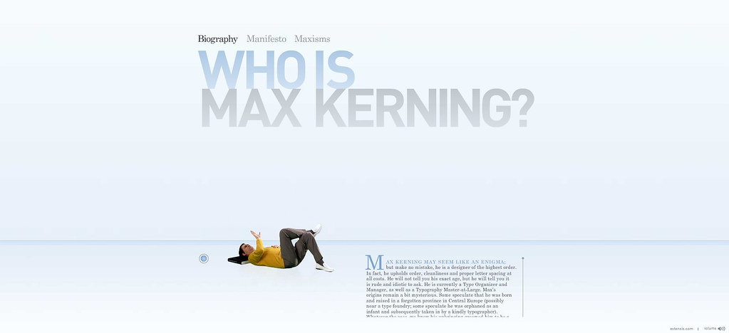
Max Kerning

No comments:
Post a Comment