Thursday, October 30, 2008

we packed and We moved!

We created a new blog at an independent location. The new parachute blog "Upscale Typography" was officially launched on October 8 with several new features. This blog posts articles in 6 main categories, all about typography. For instance, under the gadget category you'll find fresh new products made with type and under history references to great typography from the past. Contemporary designers will be interviewed, new releases and pre-release notifications -for typefaces worth mentioning- will be presented. Finally news from all over the world and of course powerful tips & techniques.
But this is only the beginning. Come and visit us, leave a comment, send your feedback, propose an articles that you will like to read we are waiting you!

blog.parachutefonts.com

Wednesday, October 8, 2008

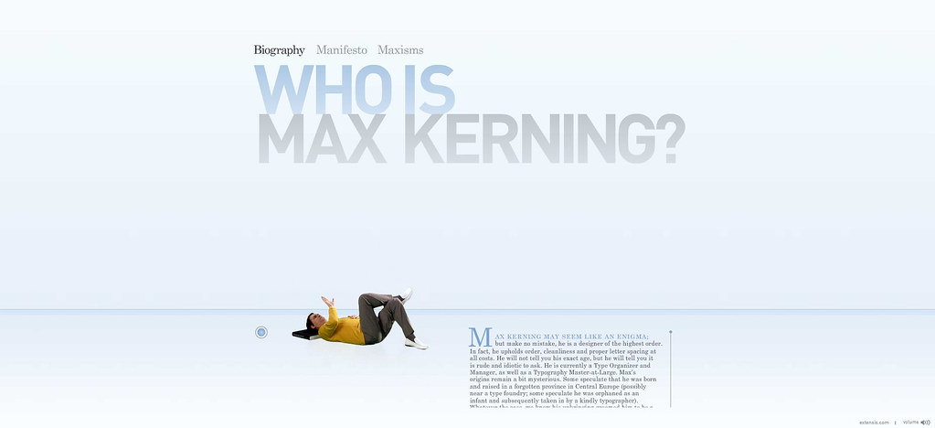
Who is Max Kerning?


He is a designer of the highest order, in fact he upholds order, clean lines and proper letter spacing at all cost! He is a man obsessed with type and and his name is Max Kerning. “When I look around, I see disorder in the world—needless chaos and messes. I sense panic and stress. In fact, I feel it myself. It rattles my soul and gives me a headache and a sourness of the stomach. This is because everywhere I am assaulted by sloppy text that is displeasing to the eye. There is no respect for proper letter spacing and font choice. Letters are squished together, piled up, overlapped and umbled. They are inappropriately and self-indulgently tracked out. People mix typefaces with incompatible type styles. Or they think, “Why use a simple, clean typeface to convey an idea when you can use three or five or twelve.” This is wrong. This is sad. This is an affront to a cultured society, and it must be stopped. Immediately, before everything is tossed away to an angry wind. Order must be allowed to thrive, to flourish, to bring us into a tidy harmony.” -Max Kerning
Max is here to to bring order in a chaotic typographic world.

Max Kerning

Wednesday, September 24, 2008

ABC 3D Book

This is not just a book but a work of art. Each of the 26 three-dimensional letters move and change before your eyes as you flip through the pages. Book designer MARION BATAILLE has managed to amaze us. Boldly conceived and brilliantly executed with a striking black, red, and white palette, this is a book that readers and art lovers of all ages will treasure for years to come. This October will be published.

Friday, September 19, 2008

Typecube

Chris Clark has recently graduated with a first class honours degree in Graphic Design from the University of the West of England. One of his project is the "typecube". This is a design box which contains 64 cubes with different forms on every side of the cube, which provide the basis of two dimensional and three dimensional typographic systems, encouraging flexibility within uniform structure. It is a very creative type game which will be on production soon.
chris-clarke

Tuesday, September 9, 2008

Bodoni as never seen before.

The online version of Bodoni Script Pro has just been released. Based on Bodoni’s distinct swash capitals, this is not simply a digital version of his work, as this typeface was designed with connected lowercase characters and capitals with extra calligraphic elements. It was first released back in 2002 and published in Parachute’s award-winning catalog/book IDEA/Trendsetting Typography vol.1. Later in 2005 a large number of ornaments and borders was revived. All this work was left behind until recently when it was revisited to create a complete 'Pro' family. Several new uppercase and lowercase glyphs were designed in order to make it stand out on its own. Bodoni Script Pro is a (3+1)-weight superfamily. It supports 10 special opentype features including 'contextual alternates' as well as support for both Latin and Greek. Each font comes with 725 glyphs including a large number of alternates as well as 144 ornaments. The full package includes an additional 'bonus font' which contains 120 frame parts. These parts, when put together, create some truly amazing borders.

Bodoni Script Pro

Monday, June 30, 2008

screensavers

These tasteful and unique typographic screensavers will satisfy your design appetite and most definitely will not put you to sleep. Designed by award-winning designer Babis Touglis to work flawlessly on both Mac and PC computers at any resolution. There are all together 6 different screen savers to choose from. It is easy to download and are all free, courtesy of Parachute®. Let your screen go off and enjoy the view!


download the screensavers

Friday, May 23, 2008

Parachute wins international award.

Parachute wins international award.
European Design Awards 2008 - Stockholm | Sweden
It was a great night at the Awards. The elite of European designers showed up for 5 days in Stockholm, to celebrate and award excellence in communication design. The European Design Awards is the premium venue that honors the best in European design. This year, it was hosted in Stockholm, Sweden May 15-19 as part of the European Design Week which included several exhibitions, a 3-day conference, an award ceremony, a formal reception, two design walks to 7 agencies and open houses. ¶ The ED Awards Ceremony honorsthe winners in 27 categories. This year, the award for original typeface went to Parachute® for the Centro Pro typeface superfamilies. In his acceptance speech, Panos Vassiliou the designer of Centro Pro, was quoted saying “...it is awards like these that make you feel that your work is appreciated, it is awards like these that make you feel responsible for your work, it is awards like these that raise your standards, but most of all these awards make you believe in yourself and your work. So I can say this: now more than ever I BELIEVE!”
According to the jury, “PF Centro Pro is a type system, not just a type family. This large series of 40 fonts with 1519 characters each, is composed of 3 superfamilies (serif, sans and slab), includes true italics and supports Latin, Greek and Cyrillic. It is an almost ‘invisible’ typeface which has legibility as its main attribute and is ideal for a wide range of design works. It does not attract any unnecessary attention, but rather serves its purpose. A rare case of contemporary type family working across three alphabets, Centro Pro meets an ever-growing demand for such typefaces among pan-European companies and institutions”.
¶ The night of May 18 started with an invitation by the Mayor of the City of Stockholm to a formal reception in Stadshuset (the City Hall), the very same hall used for the Nobel Prize dinners. After several rounds of red wine, we were almost ready for the Awards Ceremony which was held at the nearby Södra Teatern. But it was after the ceremony that everybody let loose when the participants were invited to the official Winners Party at the Södra Bar. When we were forced out at 2 a.m. the party was taken to after-hours clubs till the early morning hours.
Thank you for sharing our joy!!!
Further Links

The making of PF Centro Pro

More on Centro serif
More on Centro sans
More on Centro slab